
BootstrapでButtonを作る
日付 タグ bootstrap カテゴリ bootstrap目次
BootstrapでButtonを作る
今までBootstrapを使ってJumbotronやCarouselといった要素も見てきたが、基本的なButton要素を扱っていなかったので、 今回はBootstrapでのButtonコンポーネントのサンプルを作って使い方などを見ていきたい。
なお、今回作ったサンプルのソースコードは参照用としてGithubの以下に置いてある。 https://github.com/hugodeblog/bootstrap-samples
基本のボタン
<button type="button" class="btn btn-primary">Primary</button>
<button type="button" class="btn btn-secondary">Secondary</button>
<button type="button" class="btn btn-success">Success</button>
<button type="button" class="btn btn-info">Info</button>
<button type="button" class="btn btn-warning">Warning</button>
<button type="button" class="btn btn-danger">Danger</button>
<button type="button" class="btn btn-dark">Dark</button>
<button type="button" class="btn btn-light">Light</button>
<button type="button" class="btn btn-link">Link</button>
btn-* でBootstrapで用意されているボタンスタイルがそのまま利用できる。

ボタン(リンク要素)
<a class="btn btn-primary" href="#" role="button">Link Button</a>
aタグでリンク要素のボタンにするときは、role="button としてaタグで囲めば良い。

アウトラインボタン
<button type="button" class="btn btn-outline-primary">Primary</button>
<button type="button" class="btn btn-outline-secondary">Secondary</button>
<button type="button" class="btn btn-outline-success">Success</button>
<button type="button" class="btn btn-outline-info">Info</button>
<button type="button" class="btn btn-outline-warning">Warning</button>
<button type="button" class="btn btn-outline-danger">Danger</button>
<button type="button" class="btn btn-outline-dark">Dark</button>
<button type="button" class="btn btn-outline-light text-dark">Light</button>
ボタンのアウトライン(枠線)のみ残して、背景を透過したボタンにするにはbtn-outline-* を用いれば良い。

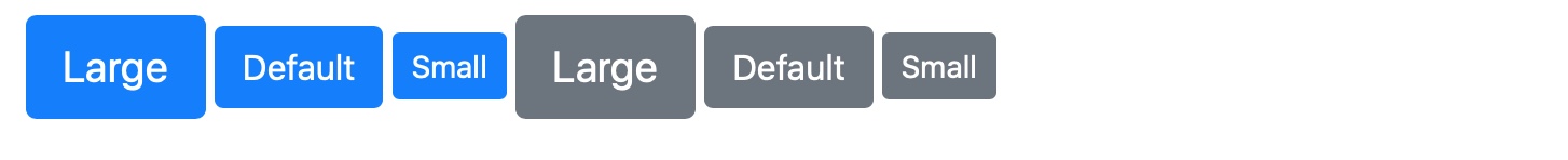
ボタンのサイズ
<button type="button" class="btn btn-primary btn-lg">Large</button>
<button type="button" class="btn btn-primary">Default</button>
<button type="button" class="btn btn-primary btn-sm">Small</button>

<button type="button" class="btn btn-secondary btn-lg">Large</button>
<button type="button" class="btn btn-secondary">Default</button>
<button type="button" class="btn btn-secondary btn-sm">Small</button>
ボタンの大、普通、小のサイズ指定も可能。
大はbtn-lg
、小はbtn-sm
ボタンの無効化
<button type="button" class="btn btn-primary" disabled>Primary</button>
<button type="button" class="btn btn-secondary" disabled>Secondary</button>
ボタンを押せない無効化したグレーアウトの状態にするには、disabled を指定する。

ボタンの無効化(リンク要素の場合)
<a href="#" class="btn btn-primary" disabled>Disabled Link Button</a> <!-- NG -->
<a href="#" class="btn btn-primary disabled">Disabled Link Button</a>
ただし、aタグのリンク要素になっているボタンではdisabled をただ付け加えただけでは無効化の状態にはできない。class="disabled" を追加する必要があることに注意する。

左は無効化できない。右は正しくボタンを無効化できている。
全部まとめたサンプルで動作チェック
上記の全部のパターンを入れ込んだファイルを作り、動作テストをしてみた。
index_button.html
<html lang="ja">
  <head>
    <!-- Required meta tags -->
    <meta charset="utf-8">
    <meta name="viewport" content="width=device-width, initial-scale=1, shrink-to-fit=no">

    <!-- Bootstrap CSS -->
    <link rel="stylesheet" href="https://stackpath.bootstrapcdn.com/bootstrap/4.5.0/css/bootstrap.min.css" integrity="sha384-9aIt2nRpC12Uk9gS9baDl411NQApFmC26EwAOH8WgZl5MYYxFfc+NcPb1dKGj7Sk" crossorigin="anonymous">

    <title>Bootstrap Test</title>
  </head>
  <body>
    <div class="container">
      <h1>BootstrapのButton</h1>
      <p>BootstrapのButtonを使った例いろいろ</p>

      <h2>基本のボタン</h2>
      <div>
        <button type="button" class="btn btn-primary">Primary</button>
        <button type="button" class="btn btn-secondary">Secondary</button>
        <button type="button" class="btn btn-success">Success</button>
        <button type="button" class="btn btn-info">Info</button>
        <button type="button" class="btn btn-warning">Warning</button>
        <button type="button" class="btn btn-danger">Danger</button>
        <button type="button" class="btn btn-dark">Dark</button>
        <button type="button" class="btn btn-light">Light</button>
        <button type="button" class="btn btn-link">Link</button>
      </div>
      <br>

      <h2>ボタン(リンク要素)</h2>
      <div>
        <a class="btn btn-primary" href="#" role="button">Link Button</a>
      </div>
      <br>

      <h2>アウトラインボタン</h2>
      <div>
        <button type="button" class="btn btn-outline-primary">Primary</button>
        <button type="button" class="btn btn-outline-secondary">Secondary</button>
        <button type="button" class="btn btn-outline-success">Success</button>
        <button type="button" class="btn btn-outline-info">Info</button>
        <button type="button" class="btn btn-outline-warning">Warning</button>
        <button type="button" class="btn btn-outline-danger">Danger</button>
        <button type="button" class="btn btn-outline-dark">Dark</button>
        <button type="button" class="btn btn-outline-light text-dark">Light</button>
      </div>
      <br>

      <h2>ボタンのサイズ</h2>
      <div>
        <button type="button" class="btn btn-primary btn-lg">Large</button>
        <button type="button" class="btn btn-primary">Default</button>
        <button type="button" class="btn btn-primary btn-sm">Small</button>

        <button type="button" class="btn btn-secondary btn-lg">Large</button>
        <button type="button" class="btn btn-secondary">Default</button>
        <button type="button" class="btn btn-secondary btn-sm">Small</button>
      </div>
      <br>


      <h2>ボタンの無効化</h2>

      <div>
        <button type="button" class="btn btn-primary" disabled>Primary</button>
        <button type="button" class="btn btn-secondary" disabled>Secondary</button>
      </div>
      <br>

      <h2>ボタンの無効化(リンク要素の場合)</h2>
      <div>
        <a href="#" class="btn btn-primary" disabled>Disabled Link Button</a> <!-- NG -->
        <a href="#" class="btn btn-primary disabled">Disabled Link Button</a>
      </div>
      <br>


    </div>

    <!-- Optional JavaScript -->
    <!-- jQuery first, then Popper.js, then Bootstrap JS -->
    <script src="https://code.jquery.com/jquery-3.5.1.slim.min.js" integrity="sha384-DfXdz2htPH0lsSSs5nCTpuj/zy4C+OGpamoFVy38MVBnE+IbbVYUew+OrCXaRkfj" crossorigin="anonymous"></script>
    <script src="https://cdn.jsdelivr.net/npm/popper.js@1.16.0/dist/umd/popper.min.js" integrity="sha384-Q6E9RHvbIyZFJoft+2mJbHaEWldlvI9IOYy5n3zV9zzTtmI3UksdQRVvoxMfooAo" crossorigin="anonymous"></script>
    <script src="https://stackpath.bootstrapcdn.com/bootstrap/4.5.0/js/bootstrap.min.js" integrity="sha384-OgVRvuATP1z7JjHLkuOU7Xw704+h835Lr+6QL9UvYjZE3Ipu6Tp75j7Bh/kR0JKI" crossorigin="anonymous"></script>
  </body>
</html>
これの動作チェックしてみた結果は以下の通り。
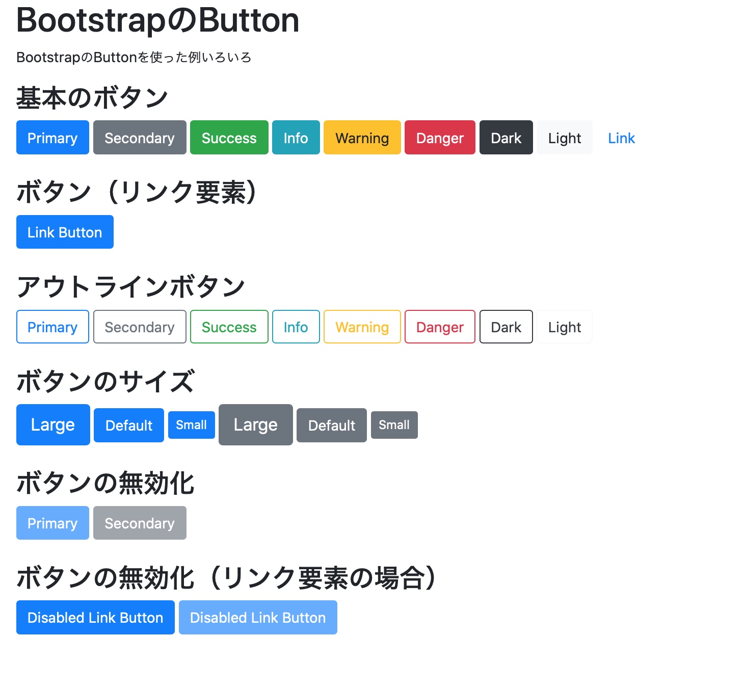
上記で説明してきた通りの想定通りの動作となっている。
もうちょっと凝ったデザインのボタンを作りたい場合は自分でCSSスタイルを調整する必要があるかもしれないが、基本的なボタンのデザインで良いならばBootstrapで用意されているボタンを利用すれば良いだろう。